

PROCESS
Design Culture Now Poster

Sketches
I began by creating a series of quick thumbnail sketches to explore different composition options. I experimented with several layouts that placed the title at the top of the visual hierarchy, making it the most prominent element. I decided that the title would be the best place to use the vernacular typeface, as its unconventional appearance naturally draws attention and helps establish a clear focal point.

In my next set of sketches, I refined the simpler layouts because they felt cleaner and allowed the typography to remain the primary focus, which is appropriate for a typography assignment. I also explored the idea of incorporating photocopied string to add texture and visually connect the blocks of body text. While I liked the concept, I was concerned that it might come across as cliché.

Another idea I explored was scattering the text boxes in and around a large title. This could be arranged either in a random, spontaneous composition or in a more structured layout using criss-crossing lines or diagonals. I also continued experimenting with the string concept, trying to make it more subtle and understated. However, it still didn't resonate with me, as it felt too familiar and lacked originality.

Upon reflection, I decided to move in a different, more interesting direction. I considered using the photocopy process with ripped or crumpled paper to create expressive textures, perhaps using it only for the title to make it stand out.
I also explored the idea of constructing a folded paper form, such as an origami shape or a paper fortune teller, to introduce a more structured and tactile visual element.

Version #1


To reflect the folded geometry of the paper, I created a series of custom geometric text boxes. While they added visual interest, they were still overshadowed by the large title. Introducing a high-contrast text box for the secondary level of the poster's visual hierarchy helped balance the composition and better distribute visual emphasis across the page.


The composition was lacking movement and felt somewhat static, so I came up with the idea of making the text appear as though it were being carried across the page by paper airplanes. This not only introduced a stronger sense of motion but also reinforced the paper theme established by the title treatment.


I came up with another idea: using a spare paper scan as the background. It introduces additional texture and a subtle sense of movement without relying on more literal visual elements, such as paper airplanes, making the composition feel more cohesive and refined.

To complement the folded paper background, I experimented with warping the text to echo the paper's creases and contours. My TA was not particularly enthusiastic about this direction and was especially critical of the typeface I had chosen for the title. He suggested replacing it with a simpler sans serif to avoid compounding the legibility issues already introduced by the crumpled paper texture.
Version #2

I then explored a more structured approach, experimenting with how much of the text could be printed on the crumpled paper.
During critique, the TA wasn't a fan of the handwritten typeface I had used for the body text. However, the project brief specifically required the use of one handwritten, vernacular, or "ugly" typeface. Since I had already taken his earlier advice and changed the title to a more neutral sans serif, I assumed the distinctive typeface needed to be used for the body text instead. He explained, however, that the distortion created by the crumpled paper effectively transformed the neutral title typeface into the required vernacular element, meaning the body copy could remain in a more conventional, legible typeface.

The TA also felt that incorporating the scanned paper texture throughout the grid layout was excessive. He preferred limiting the scanned effect to the title and address rather than applying it to the entire poster.
Version #3

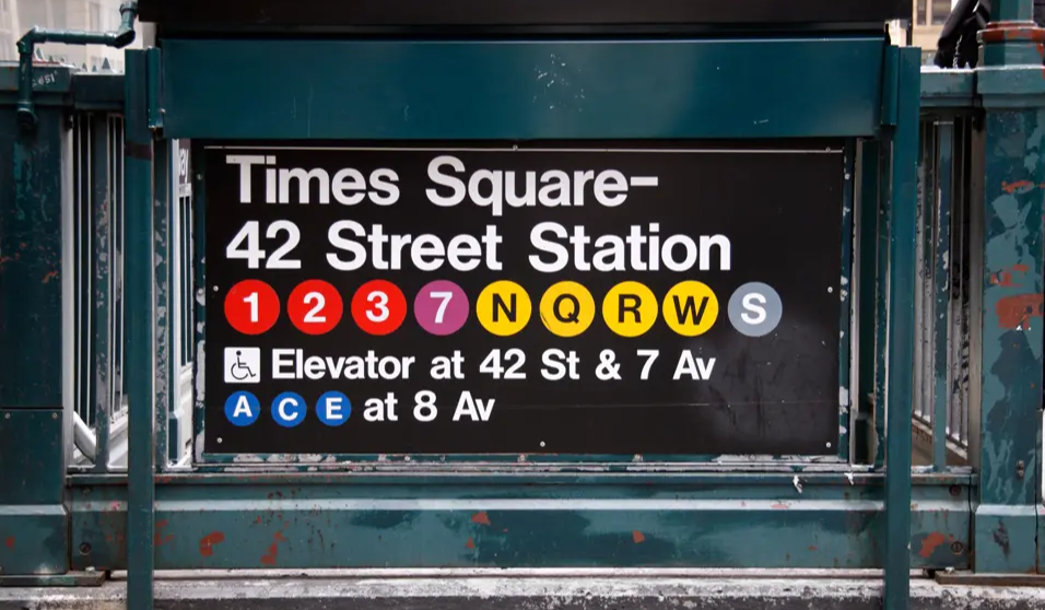
The TA suggested drawing inspiration from New York City subway signage, an idea that fit well given that the Design Culture Now conference is set in New York. I incorporated this direction into the design and found that it strengthened the overall concept.