

PROCESS
Design at York U Promotion
Collage Exercise


For this class exercise, I made a collage of hands holding art tools coming out of a person’s mouth. I like how directly the image connects to the tagline, but the overall effect feels a bit too grotesque. Still, I’m interested in pursuing this direction further.
Sketches
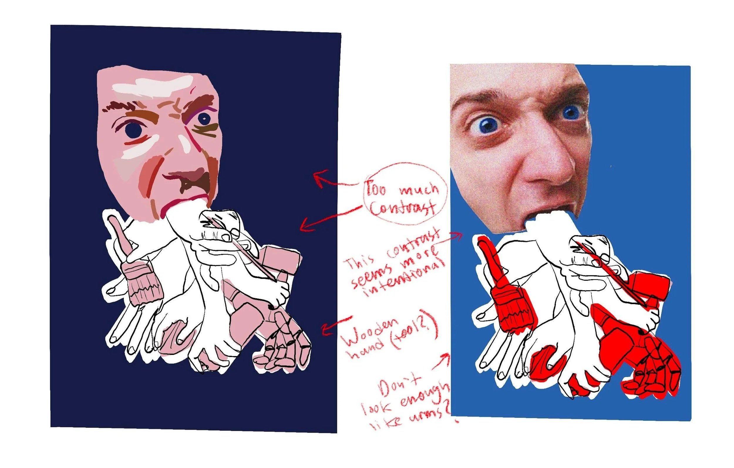


I then translated the collage into a range of illustrated styles to see how the idea would read without photographic imagery. While I still prefer the impact of the all-photo version, I’m hesitant to rely entirely on sourced imagery.
I also sketched simplified compositions using a single hand rather than several, but the result felt even more unsettling.

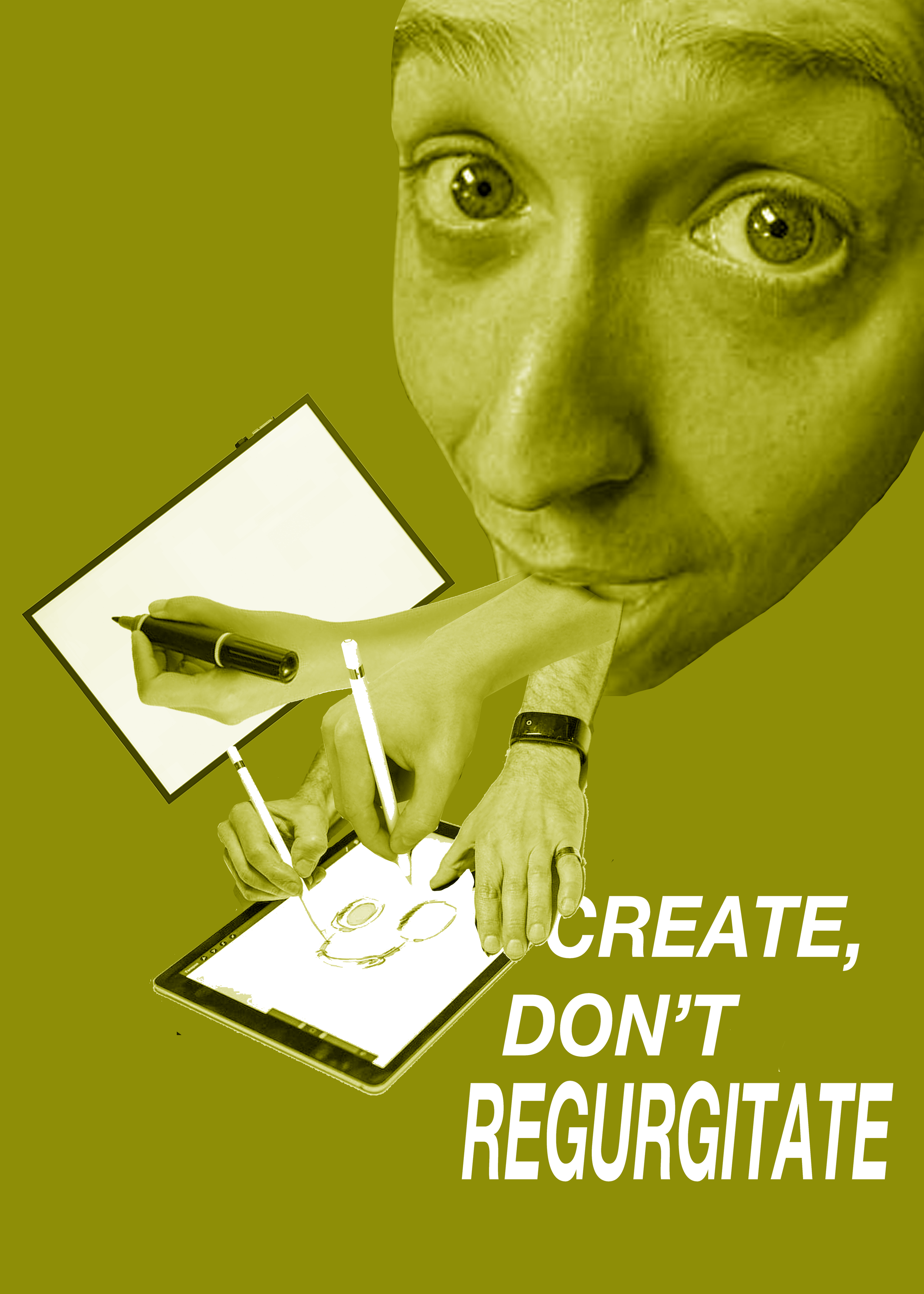
My favourite idea was to have each hand interact with the title using a different design tool—mouse, touch screen, or Apple Pencil.


Another direction was to base each postcard on one of the three design fields. Finding clear, recognizable imagery for each was tricky.
Version #1


As I tested the three-branches collage direction, sourcing suitable arm imagery proved challenging; most references felt unrelated to design or were too low resolution. Variations in shadow and lighting across images also persisted despite the monochrome palette.
Version #2
I started to feel like I needed to pivot. I’ve always found the realism of human arms coming out of a mouth a bit strange, so I looked at replacing them with something else.


While playing around in Photoshop, I liked the idea of showing the act of designing within the design itself—selection tools, grids, highlighted text. Still, the concept feels very loose and subjective, and I’m not sure it would connect with most people.