
PROCESS
Design at York U Promotion
User Research
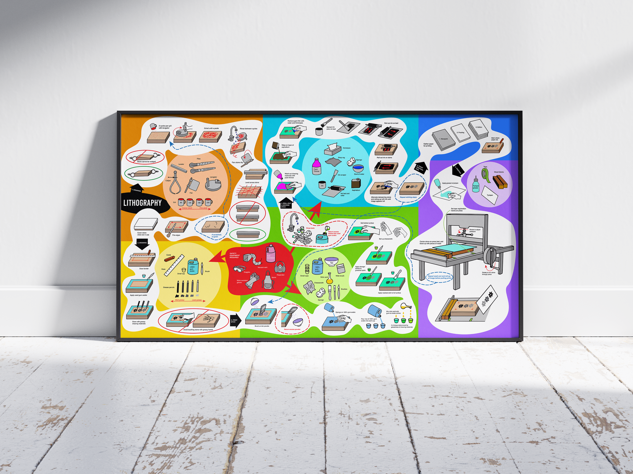
When considering my target audience, I imagine fellow beginner lithographers who need a resource (like a poster on wall of the print media lab) to help guide them through the steps.
I think that I would be able to pique the interest of my user group by simply having simple, clear clipart images to illustrate the long and complicated process of lithography. At the moment, my lithography teacher has only been supplying us with written instructions. Artsy students tend to be visual learners. I can also attract attention with eye-catching colour and fun compositions.
Primary research
In my lithography class, I have been taking notes during the teacher’s demonstrations. I find that this helps as she includes steps that are not written in the instructions.
Initial Considerations
I was hoping to focus my infographic project on the traditional multi-step stone lithography process - a process that I was learning in my printmaking class.
But when looking for visuals online for the lithography process, most of the diagrams that came up were for different types of lithography that have more machine involvement.
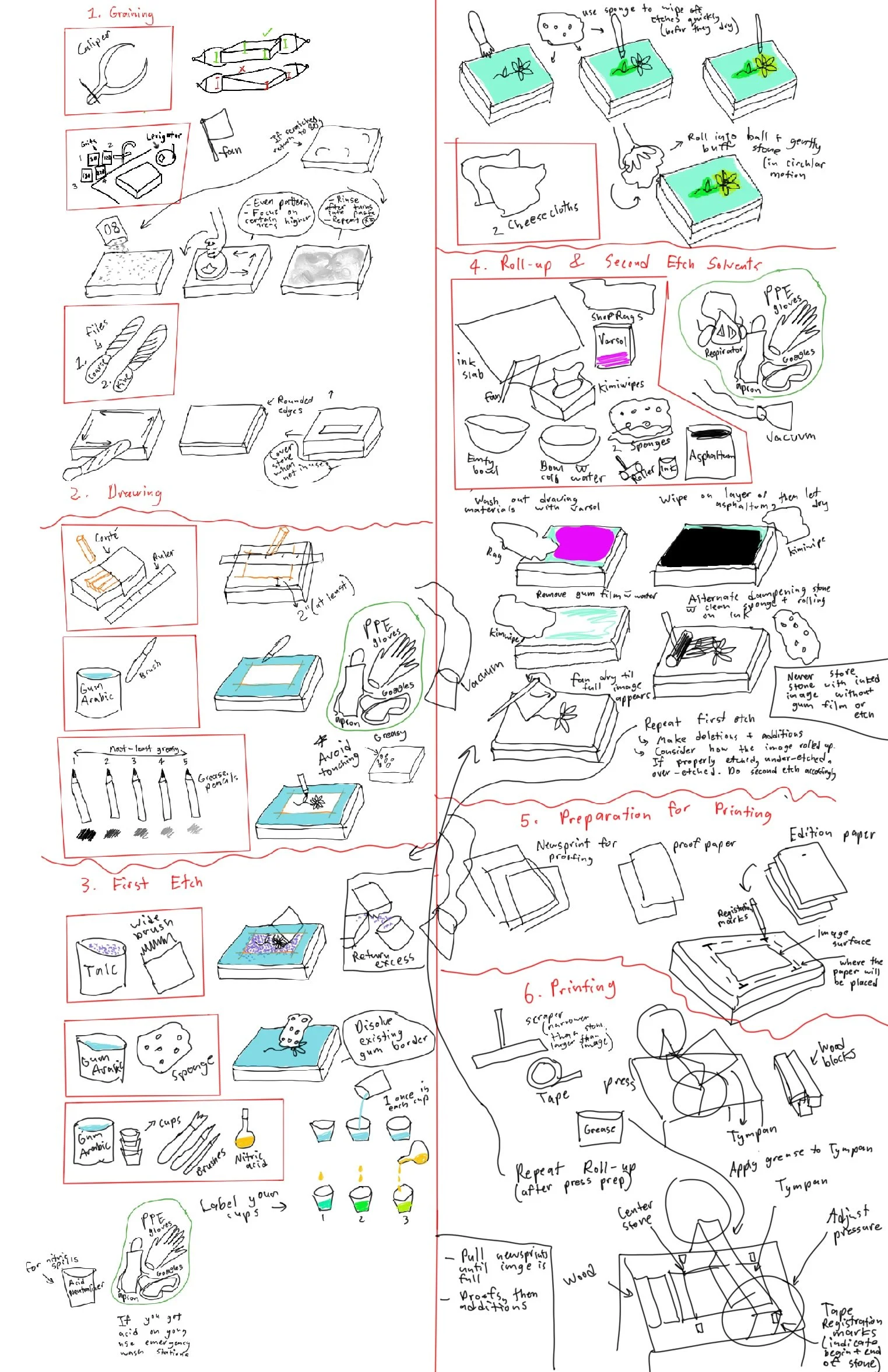
- The next step for me was to consider all of the information given by my teacher in person and in written form and summarize it. This will help me to more easily digest the complex process and reduce the number of steps that I will need to include in my infographic.
- I started to feel limited by the tabloid size poster format. I kept falling into the same problems where I would run out of space or end up having to separate the page into two jagged columns.
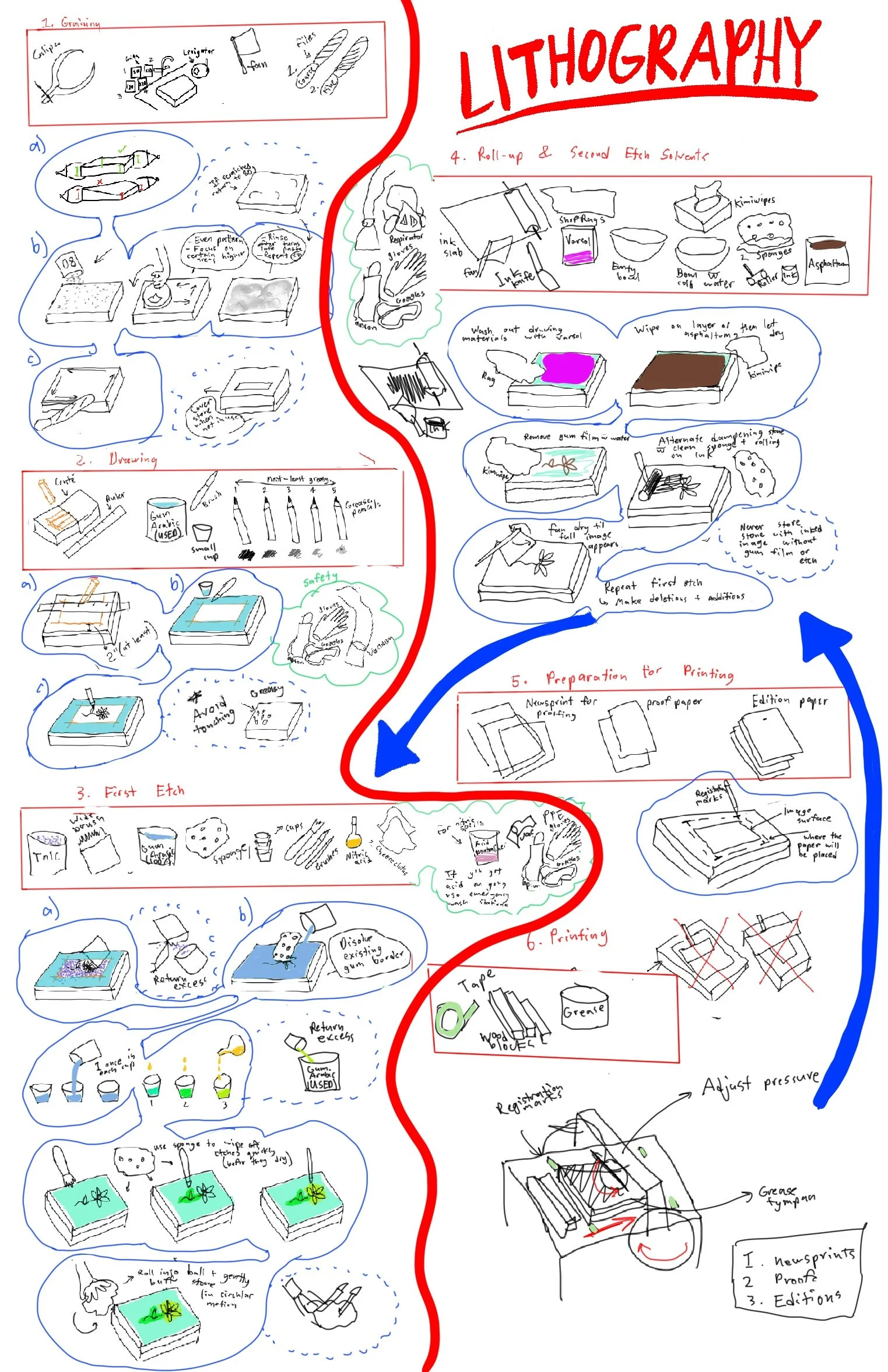
- I re-thought how I could compose the process. I looked at traditional brain maps/web maps that have a less rigid structure that I feel may work better for me.
- The illustrations were the most time-consuming part of my process. I tried to make everything very clear and readable. I do not want to be excessively decorative or abstract as the purpose of the visualization is to teach a complex step-by-step process.
- I kept having to add more and more images as I discovered parts of my visualization that may be too vague.
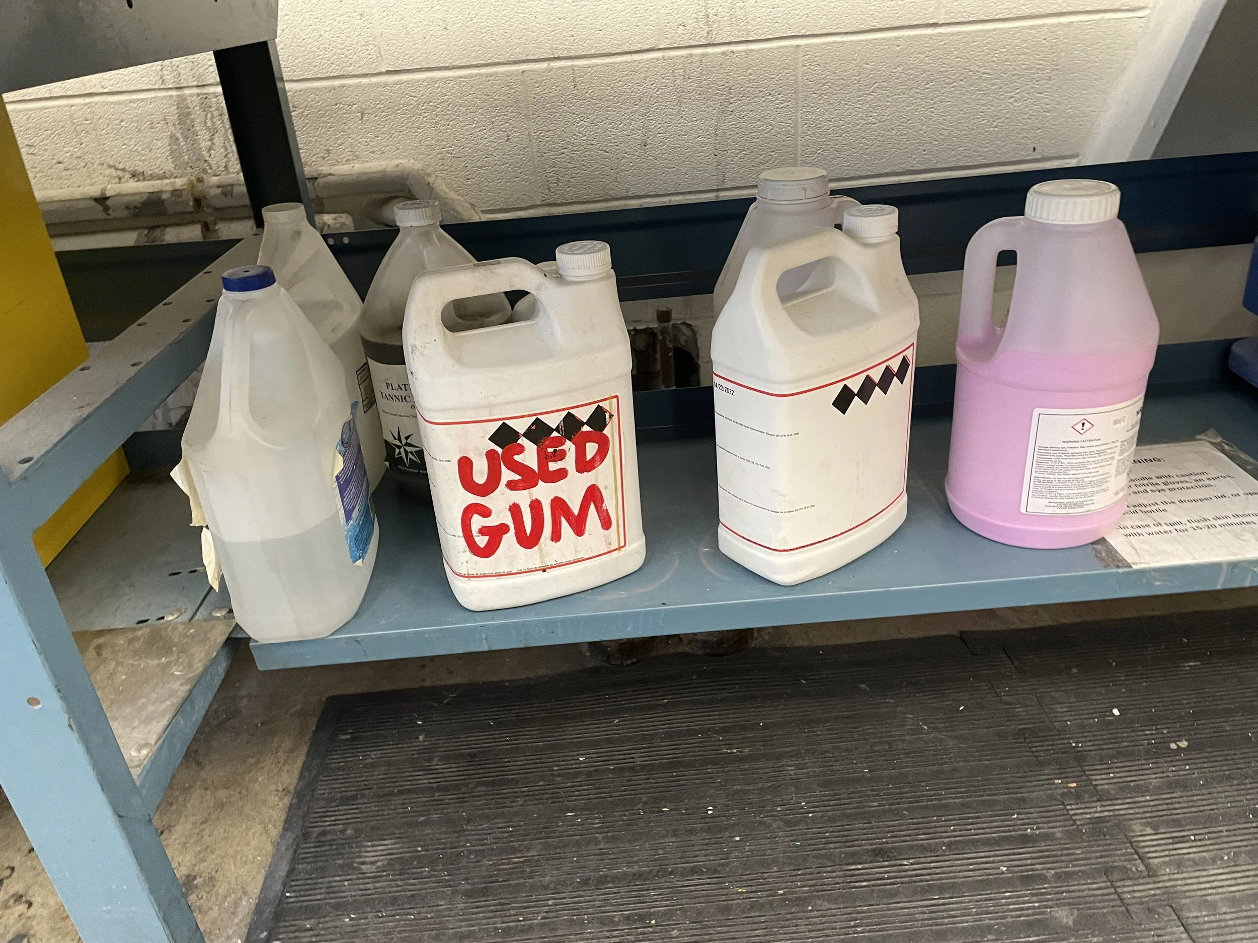
- I also added a couple of images to illustrate common mistakes in novice lithography.
- I decided that a tabloid size poster would be too small and restrictive. I knew that once I were to print the poster that the font size would be too small to read easily.
- So, I began to look at the widescreen format option instead. I figured that I would break up the composition into 6 as the lithographic process (at least my teacher’s version) has 6 main steps.
- I don’t think that a webpage is less appealing to my target users. Most of us students function almost entirely on our laptops. And in an online format, users have the ability to zoom in to make the text larger.
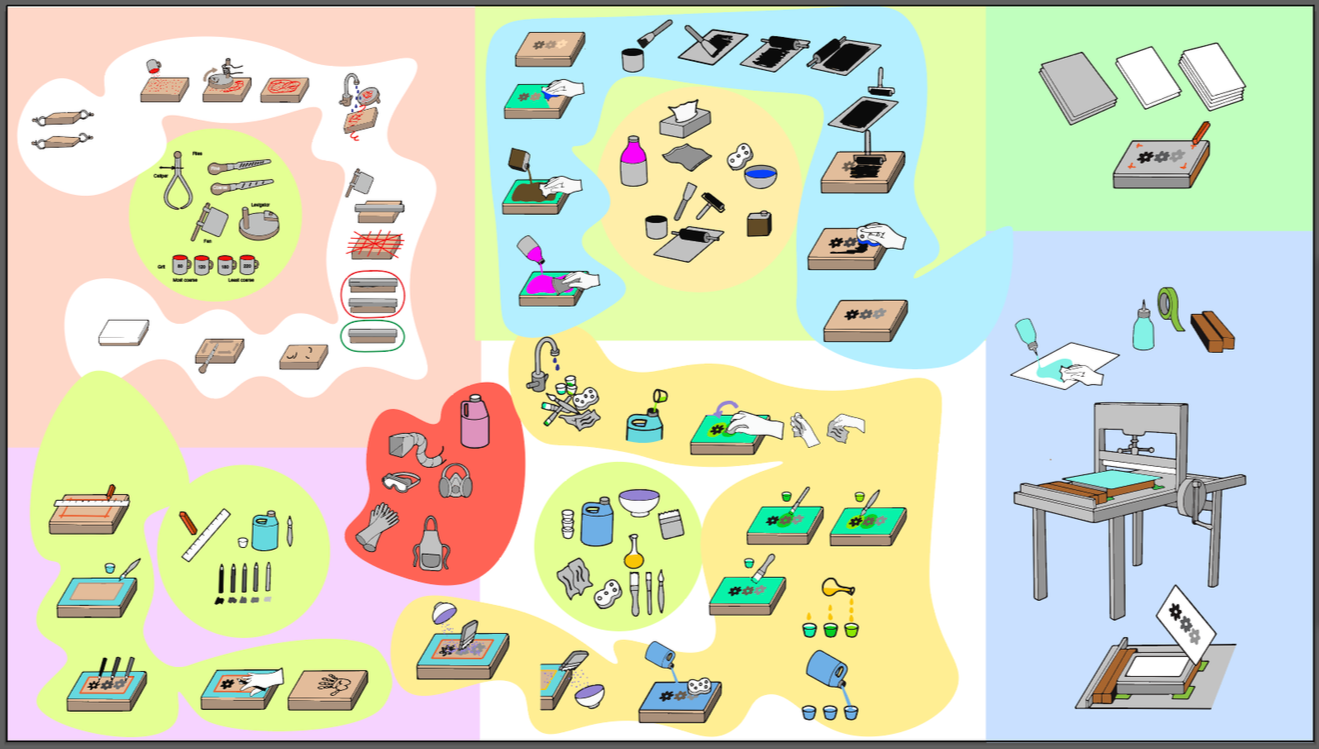
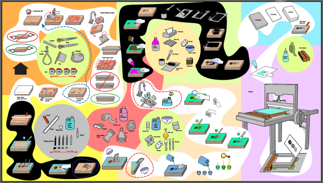
- Limiting the colour palette and putting the steps against a white background help with readability.
- One issue I faced was how to incorporate the safety equipment to show that it is needed for steps 2-4.
Sketches
- As I moved my illustrations around, I seemed to create a certain snake-like flow. But colour can make this flow difficult to follow.
