
PROCESS
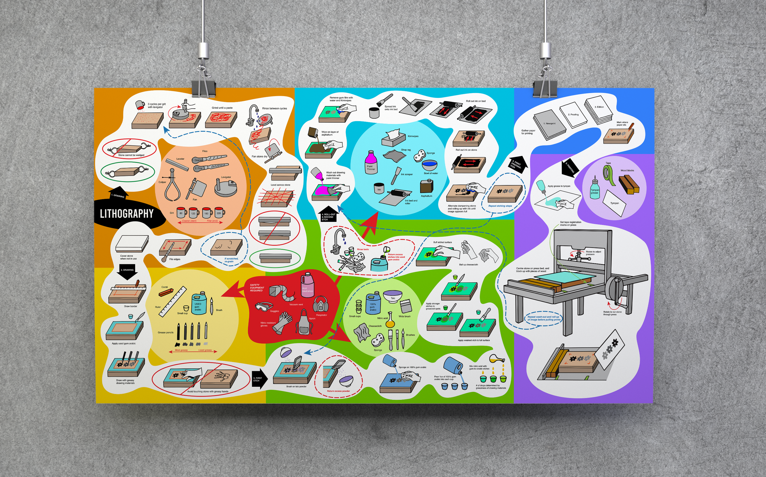
Stone Lithography Instructional Infographic
Initial Considerations
I initially wanted to focus my infographic on the traditional, multi-step process of stone lithography—a technique I was learning in my printmaking class.
However, when researching visual references online, I found that most existing diagrams focused on other forms of lithography that involve greater machine involvement. This presented an opportunity to create a resource specifically focused on the traditional process I was learning.
Research
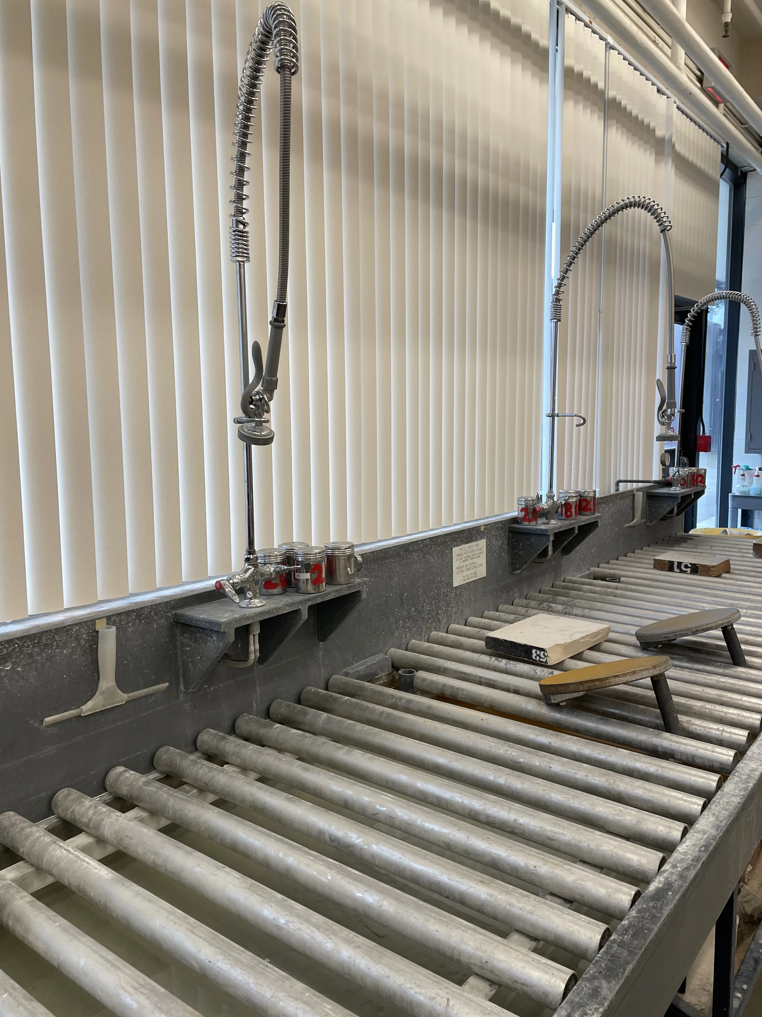
For my target audience, I envisioned fellow beginner lithographers who could use a visual reference—such as a poster displayed in the print media lab—to guide them through the process.
Because lithography involves a long and complicated series of steps, I wanted to make the information approachable through simple, clear illustrations. My lithography class primarily provided us with written instructions, while demonstrations often included additional details that were not documented. As visual learners, art students could benefit from a resource that translates these instructions into an easy-to-follow visual format.
I also saw an opportunity to use colour and playful compositions to make the process more engaging and attract attention within the lab.
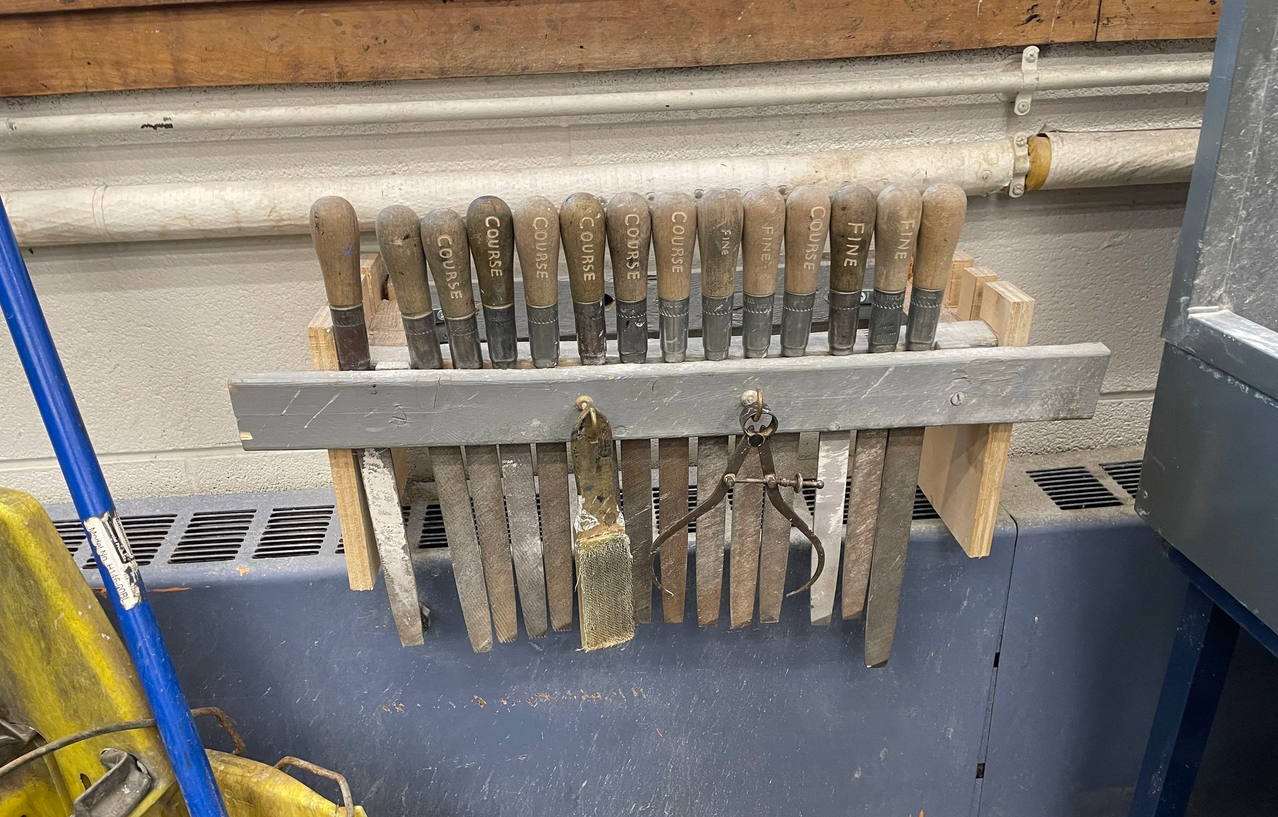
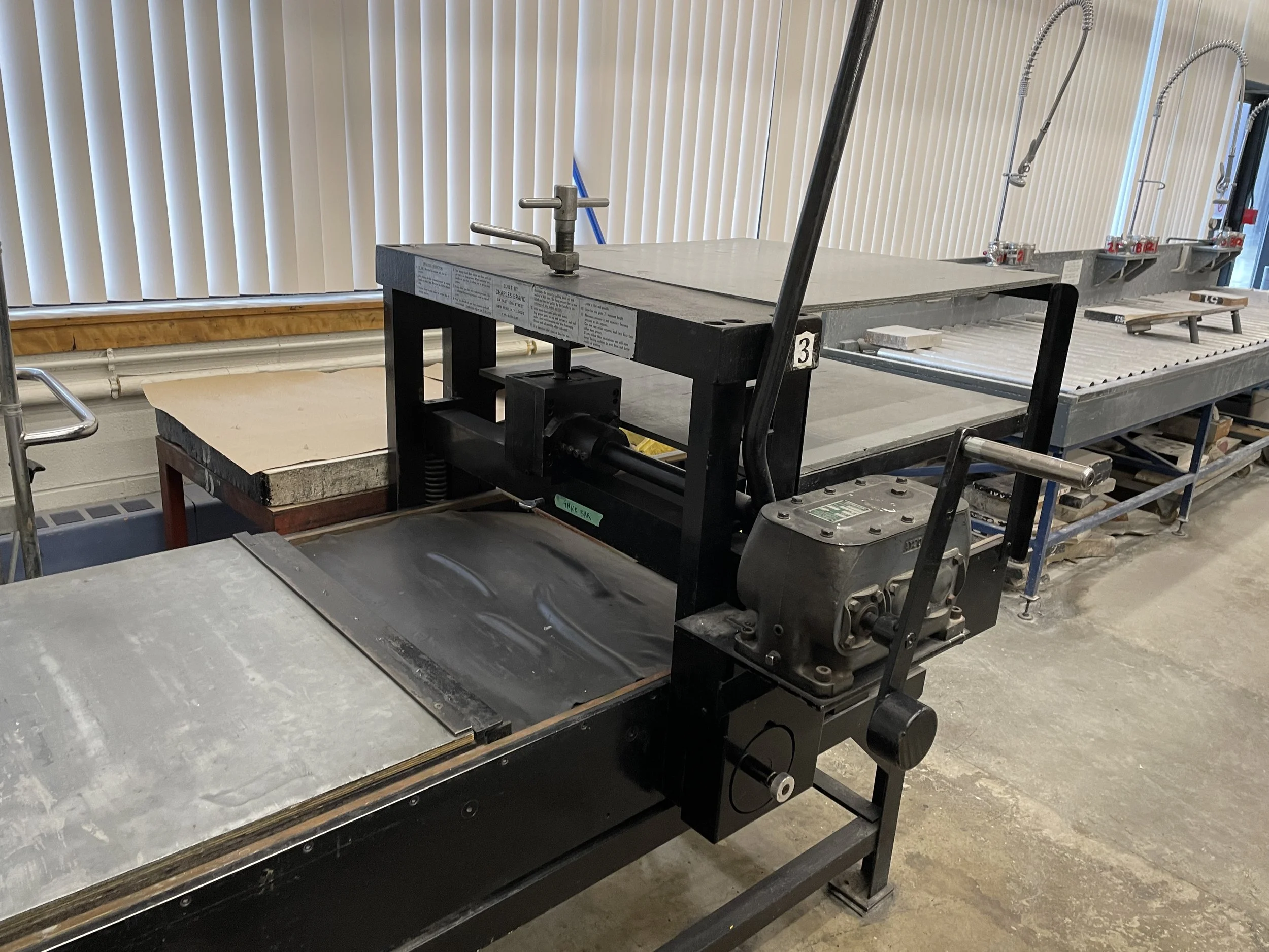
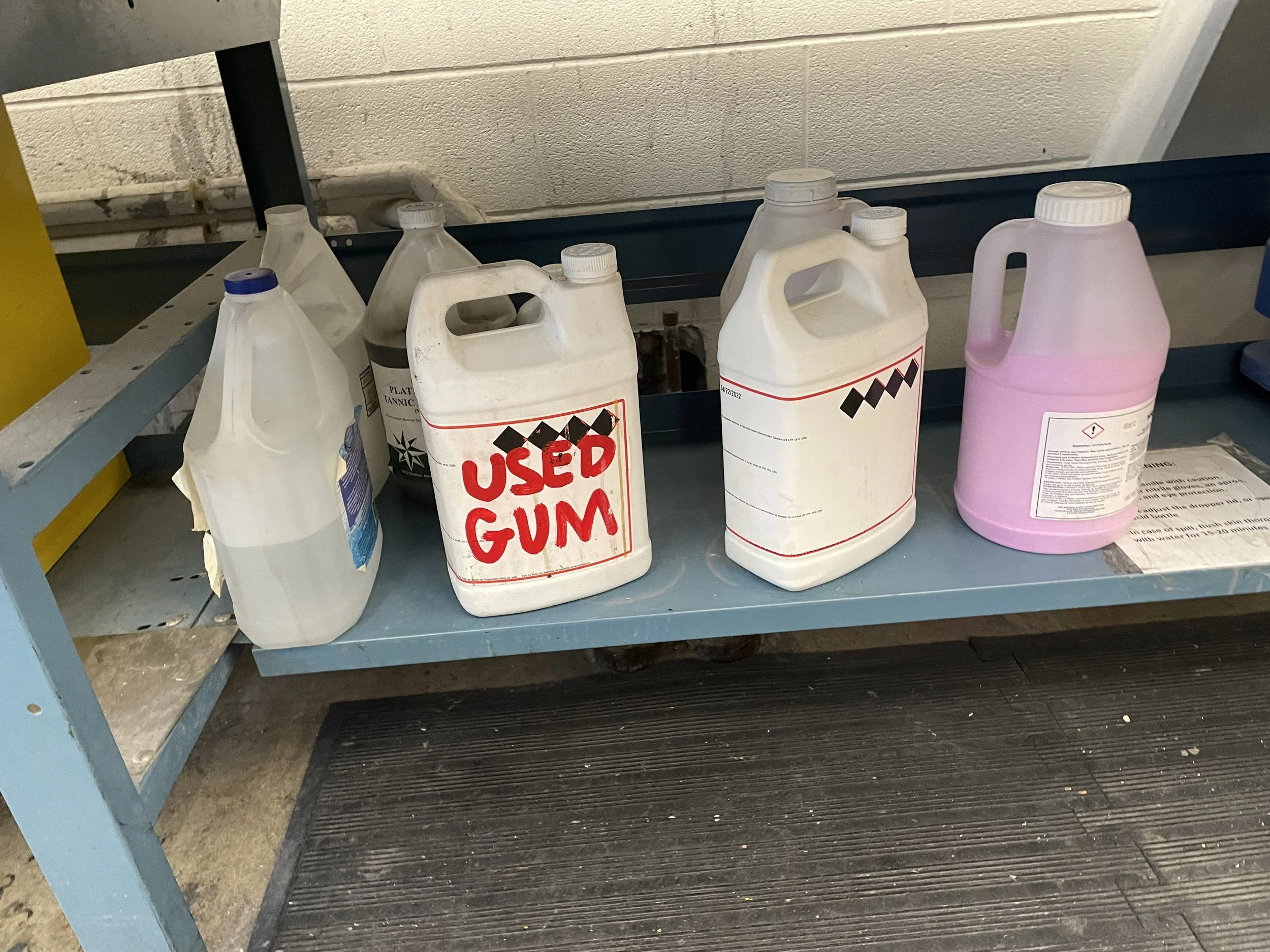
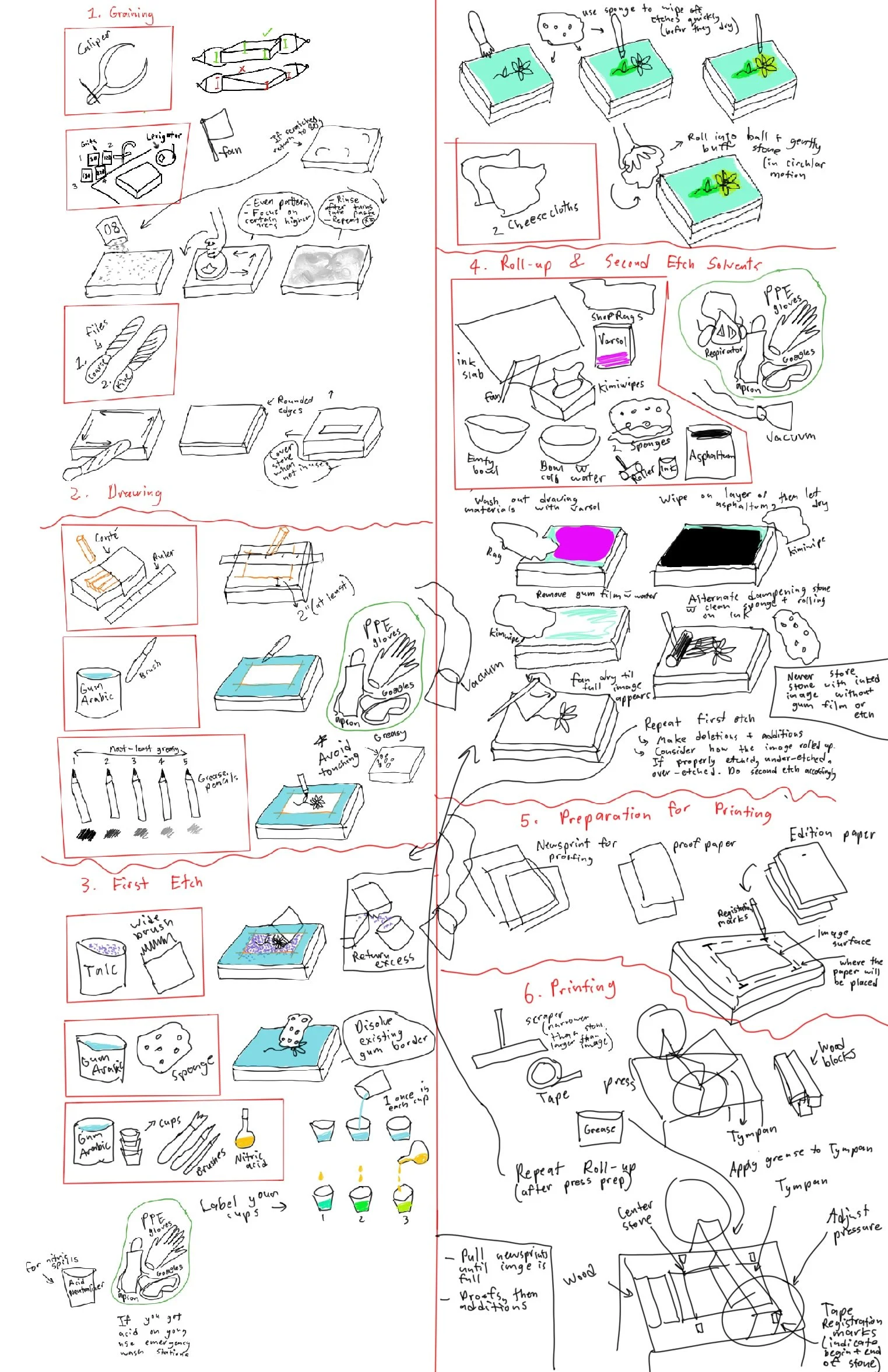
Throughout my lithography class, I took notes during my instructor’s demonstrations. These notes became an important research source, as they captured practical steps and details that were not included in the written instructions.
Development & Iteration
The next step was to consolidate the information I had gathered from my instructor’s demonstrations and written instructions. Summarizing the material helped me digest the complex process and identify the key steps that needed to be communicated in the infographic.
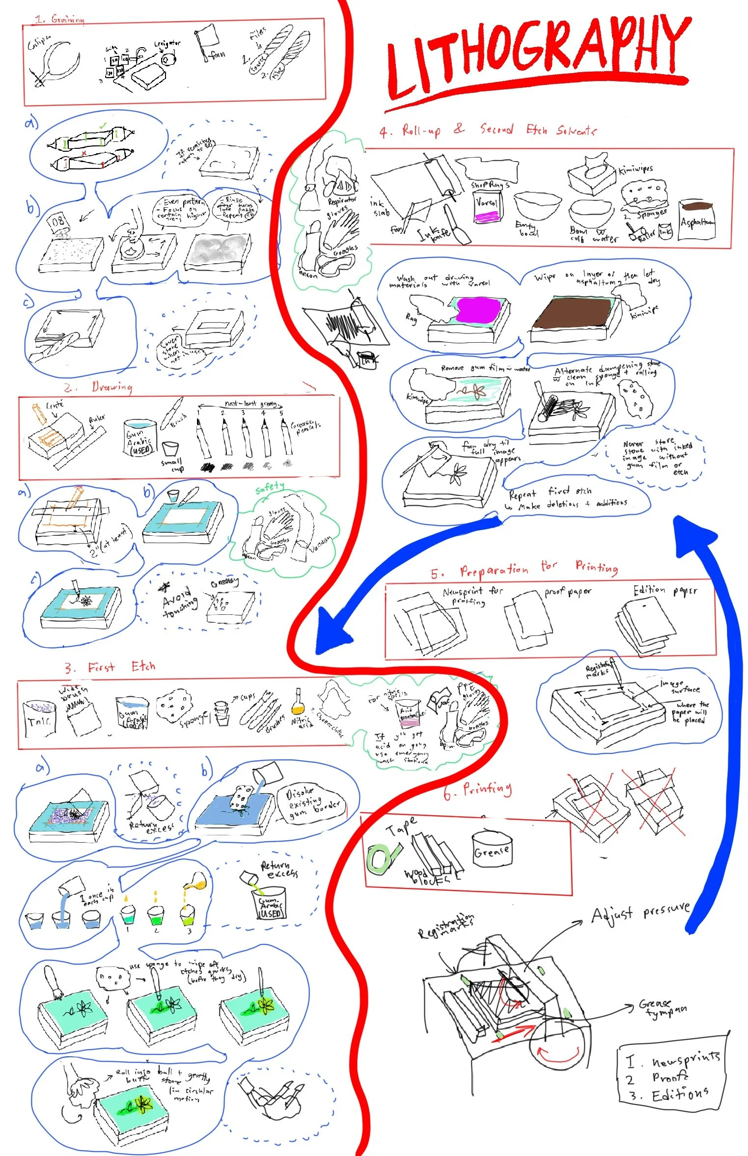
I initially worked within a tabloid-sized poster format, but quickly found it restrictive. I repeatedly ran out of space or had to divide the information into two awkward, disconnected columns. This led me to reconsider the overall structure and explore brain maps and web maps, which use a more flexible, non-linear composition.
The illustrations became the most time-consuming part of the process. I wanted each image to be clear and easy to understand without becoming overly decorative or abstract. Since the purpose of the visualization was to teach a complex, step-by-step process, clarity and readability took priority over visual embellishment. As I continued developing the infographic, I added illustrations whenever I identified a step that might otherwise be too vague. I also incorporated a few visuals showing common mistakes made by novice lithographers to make the resource more practical.
Rethinking the Format
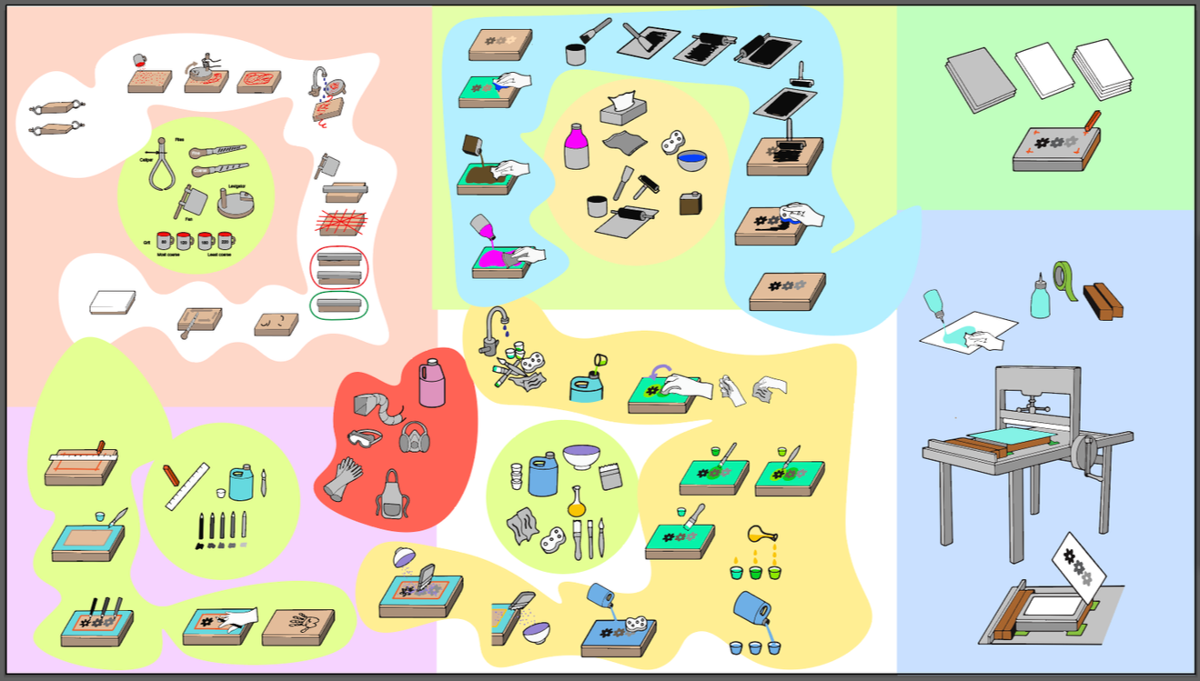
Eventually, I decided that the tabloid format was too small and restrictive. I was concerned that the final printed text would be difficult to read, particularly when trying to fit the entire process onto a single page.
I began exploring a widescreen digital format instead. I divided the composition into six sections, corresponding to the six main stages of the lithographic process as taught in my class. This format gave me considerably more space to organize the information while maintaining a clear visual hierarchy.
Moving to a digital format also felt appropriate for my target audience. As students, we already rely heavily on our laptops for coursework and research. A webpage would allow the resource to be accessed easily in the print media lab, while also giving users the ability to zoom in when they need to examine smaller text or illustrations.
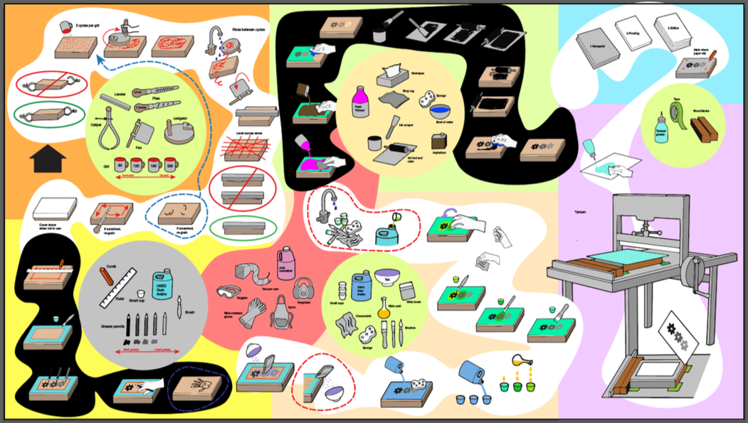
As I rearranged the illustrations, I began to notice a natural snake-like flow emerging through the composition. While this helped create a sense of movement between the steps, I found that colour could make this visual path more difficult to follow.
To improve readability, I experimented with limiting the colour palette and placing the individual steps against a white background. This created more visual separation between the illustrations and helped reinforce the order of the process without adding unnecessary visual noise.
Another challenge was communicating the use of safety equipment, which is required throughout steps 2–4. I needed to find a way to show that the equipment applied across multiple stages without repeating the same imagery unnecessarily or making the composition feel cluttered.